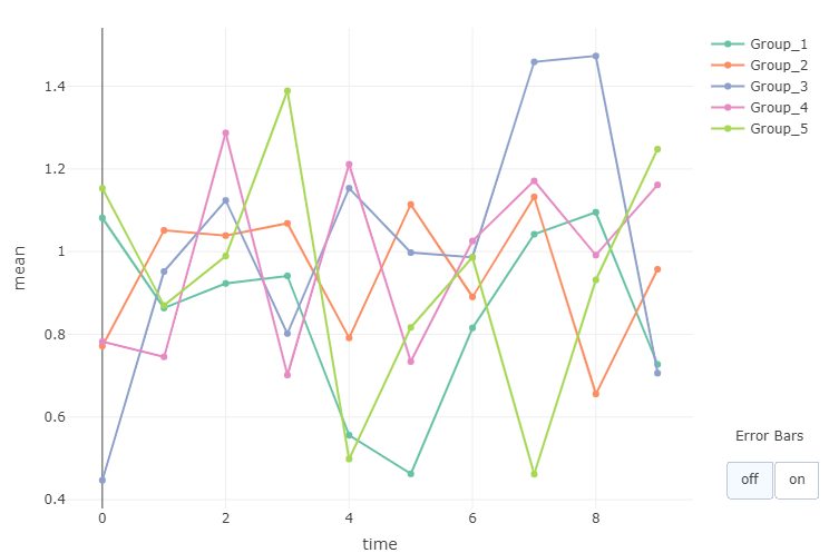
Toggling Error Bars in Plotly
Plotly charts can be enhanced with custom controls. One use of controls is to update an existing chart. This post will show how to add a couple of buttons to a chart, toggling error bars on and off. It should be noted that coloring by group affects the order (and hence validity) of error bars in a Plotly plot so a workaround has to be employed.
Generate Some Demo Data
1set.seed(12345)
2d <- data.frame(
3 time = rep(0:9, 10),
4  group = sample(paste0("Group_", seq(5)), size = 1000, replace = TRUE),
5  value = rnorm(n = 1000) + 1
6) |>
7  dplyr::group_by(time, group) |>
8  dplyr::summarise(mean = mean(value), se = sd(value) / sqrt(dplyr::n())) |>
9  dplyr::ungroup()
Initializing Chart and Adding Traces
We'll build up the chart from the demo data by first initializing an empty plot as follows:
1p <- plotly::plot_ly(type = 'scatter', mode = 'lines+markers')
The next step is to add a series of traces, one for each group, without error bars:
1for (x in unique(d$group)) {
2  p <- p |>
3    plotly::add_trace(data = d |> dplyr::filter(group == x), visible = TRUE,
4                      x = ~time, y = ~mean, type = 'scatter', mode = 'lines+markers', color = ~group)
5}
and then a second series of traces, this time with error bars but with the parameter visible=FALSE set to ensure that they are not visible when the chart is initially drawn:
1for (x in unique(d$group)) {
2  p <- p |>
3    plotly::add_trace(data = d |> dplyr::filter(group == x), visible = FALSE,
4                      x = ~time, y = ~mean, type = 'scatter', mode = 'lines+markers', color = ~group,
5                      error_y = ~list(array = se, color = group))
6}
Since we have 5 groups, our plotly chart now contains 5 traces without error bars and 5 traces with error bars. It actually contains one additional empty trace corresponding to the initial plotly::plot_ly() call when the empty chart was built. This can be deduced using plotly::plotly_build() to observe the list object sent to plotly for plotting. At this stage the following code reveals a total of 11 traces:
1p_obj <- plotly::plotly_build(p)
2print(length(p_obj$x$data))
Building the Menu Buttons
Plotly does not have the option of a toggle switch or toggle button so we'll add two buttons - one to plot without error bars and one to plot with error bars. The control works by changing the visible status so that only a subset of plots are visible. As mentioned above, we have 5 traces without error bars and 5 with. We also have the empty trace (the first trace), so in order to see just traces without error bars we'll want to show only traces 2-6 and in order to see just traces with error bars we'll want to show only traces 7-11. Here is the code to build the plotly menu buttons:
 1num_traces <- length(unique(d$group))
 2menu <- list(
 3  active = 0,
 4  type = 'buttons',
 5  direction = 'right',
 6  x = 1.2,
 7  y = 0.1,
 8  buttons = list(
 9    list(
10      label = 'off',
11      method = 'update',
12      args = list(list(visible = c(F, rep(c(TRUE, FALSE), each = num_traces))))
13    ),
14    list(
15      label = 'on',
16      method = 'update',
17      args = list(list(visible = c(F, rep(c(FALSE, TRUE), each = num_traces))))
18    )
19  )
20)
21
22annotation <- list(list(text = "Error Bars", x = 1.18, y = 0.13, xref = "paper", yref = "paper", showarrow = FALSE))
Plotting
Finally, the plot can be created by adding the menu items and annotation to the existing plotly object:
1p |>
2  plotly::layout(updatemenus = list(menu), annotations = annotation)

