Selectable Groups in Plotly
This is a short tutorial on building a plotly stripchart with a dropdown to select a dataset. It covers a few points such as how to handle stripcharts with jitter in plotly, building the plotly menu programatically and how to format a dataset to work with plotly dropdowns.
Of course, the same effect can be accomplished with a selectizeInput in shiny but this method does not rely on the use of a server 1 and can be embedded in an HTML report.
Generating Some Dummy Data
First, we build some dummy data for the plots.
1## build a data frame for demo
2df <- data.frame(
3  id = rep(seq(30), 3),
4  group_name = rep(rep(c("A", "B", "C"), each = 10), 3),
5  time = rep(paste("Time", seq(3)), each = 30),
6  value = lapply(seq(9), function(x) runif(min=x, max=x+1, n=10)) |> unlist()
7) |>
8  dplyr::mutate(group_name = as.factor(group_name))
| id | group_name | time | value |
|---|---|---|---|
| 1 | A | Time 1 | 1.809334 |
| 2 | A | Time 1 | 1.021089 |
| 3 | A | Time 1 | 1.332087 |
| 4 | A | Time 1 | 1.681937 |
| 5 | A | Time 1 | 1.623123 |
| 6 | A | Time 1 | 1.594674 |
| ... | ... | ... | ... |
Programatically Building Plotly Dropdown
Changing a dataset interactively in plotly is not as straightforward as a shiny approach of linking a selectizeInput to a parameter. Plotly's approach requires passing all data to the plot and toggling visibility. The updatemenus parameter in plotly::layout() is used to build menus (see https://plotly.com/r/dropdowns/).
The examples on the plotly site show how to restyle a graph, passing a series of parameters through updatemenus. updatemenus itself is a list and can therefore be built programatically. The code below shows how we can build the UI and logic required to select one of the three values of time in our dataset.
 1## identify the unique values in the time column
 2time_vals <- df$time |>
 3  unique() |>
 4  sort()
 5
 6## count the number of values for each time
 7v_time_group <- df |>
 8  dplyr::select(time, group_name) |>
 9  dplyr::distinct() |>
10  dplyr::arrange(time) |>
11  dplyr::group_by(time) |>
12  dplyr::summarise(count = dplyr::n()) |>
13  dplyr::pull(count)
14
15## build a set of vectors to send to updatemenus.
16## each member is a set of TRUE/FALSE values denoting visibility.
17TF_time_vals <- lapply(seq(length(v_time_group)), function(i) {
18  if (i == 1) {
19    values_false_start <- 0
20  } else {
21    values_false_start <- sum(v_time_group[1:(i-1)])
22  }
23
24  if (i == length(v_time_group)) {
25    values_false_end <- 0
26  } else {
27    values_false_end <- sum(v_time_group[(i+1):length(v_time_group)])
28  }
29  c(rep(FALSE, values_false_start), rep(TRUE, v_time_group[i]), rep(FALSE, values_false_end))
30})
 1### OUTPUTS for updatemenus
 2time_vals
 3[1] "Time 1" "Time 2" "Time 3"
 4
 5TF_time_vals
 6[[1]]
 7[1]  TRUE  TRUE  TRUE FALSE FALSE FALSE FALSE FALSE FALSE
 8
 9[[2]]
10[1] FALSE FALSE FALSE  TRUE  TRUE  TRUE FALSE FALSE FALSE
11
12[[3]]
13[1] FALSE FALSE FALSE FALSE FALSE FALSE  TRUE  TRUE  TRUE
The updatemenus list is built using the code below. Essentially it is a list of a label, for each time point, and vector of boolean values denoting visibility, for each group at each time point. It should be noted that each vector for visibility has nine values denoting the three groups (A, B and C) at the three time points (Time 1, Time 2 and Time 3). In the first, TF_time_vals[[1]], we specify that all three groups are visible for Time 1 but not Time 2 or Time 3.
1update_menus_buttons <- lapply(seq_along(time_vals), function(i) {
2  list(method = "update",
3       args = list(list(visible = TF_time_vals[[i]])),
4       label = time_vals[i]
5  )
6})
Build the Chart
If we build our plot, passing all data at once, the dropdown menu logic fails. This is because plotly expects a series of separate traces for the dropdown menu.
Therefore this code will not work:
1p <- plotly::plot_ly(
2  data = df, x = ~jitter(as.numeric(group_name)), y = ~value, type = "scatter", mode = "markers", color = ~group_name
3)
But this will:
 1## start with an empty plotly object
 2p <- plotly::plot_ly(data = df)
 3
 4for (t in time_vals) {
 5  d <- df |> dplyr::filter(time == t)
 6  p <- p |>
 7    plotly::add_trace(data = d,
 8                      x = ~jitter(as.numeric(group_name)),
 9                      y = ~value,
10                      type = 'scatter', mode = 'markers',
11                      color = ~group_name, visible = t==time_vals[1])
12}
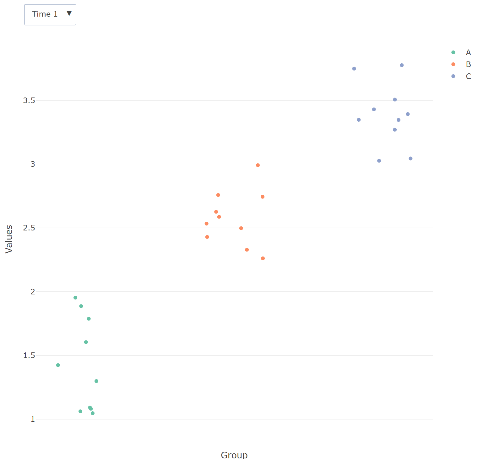
Since we'll be selecting by time, we neede to create a separate trace, one for each time. A small amount of jitter is added to the x values. This is achieved by taking the numeric value of group_name (a factor) and applying the base R jitter() function. A caveat to this approach is that the x-axis value are now numeric as opposed to the group name. Initial visibility is defined as t==time_vals[1], which will take the first value in the time_vals vector, namely Time 1.
Finally, we add some axis labels and dropdown, and return the plot.
 1p <- p |> plotly::layout(
 2  xaxis = list(title = "Group", showticklabels = FALSE, showgrid = FALSE),
 3  yaxis = list(title = "Values"))
 4
 5p <- p |> plotly::layout(
 6  updatemenus = list(
 7    list(x = 0.1, y = 1.1, buttons = update_menus_buttons)
 8  )
 9)
10
11p
-
shiny apps can now be built server-free using webR. ↩︎